Endeavor
Empowering Quality Excellence
Brand guideline Introduction
Welcome to the vibrant world of the Endeavour Brand Guidelines document. This comprehensive guide is designed to empower you with a clear and flexible set of brand guidelines that not only communicate effectively but also leave room for your creative expression to shine. In the following pages, we will take you on a journey through the fundamental elements of our brand identity, including our logo, color palette, fonts, brand devices, icons, imagery, and corporate identity. We'll also share some valuable insights and general rules for applying these elements across various media platforms. While we strongly endorse maintaining a standardized brand identity, we recognize that unique situations may call for customized solutions. Should you require guidance on adapting our brand identity beyond these guidelines, please don't hesitate to reach out to us at goce.veleski (@) gmail.com. We're here to help you bring your vision to life.
The Symbol
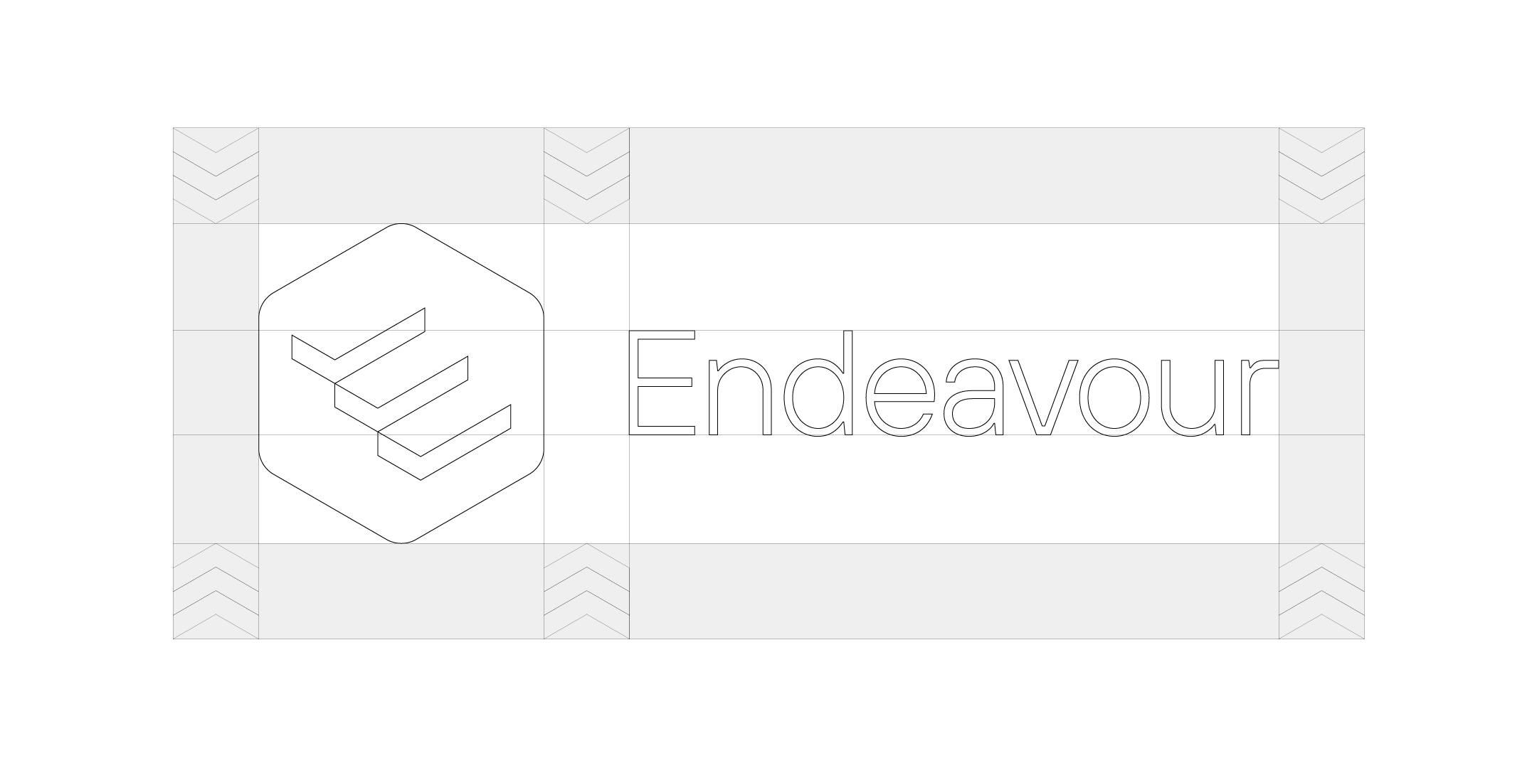
Endeavour symbol
Our logo, a rounded hexagon in vibrant orange (#ff5a00), features three checkmarks inside, forming the letter 'E' for 'Endeavour.' These checkmarks represent our triple-check guarantee for meticulous quality assurance, symbolize progress and growth like stairs, and reassure you that everything is 'A-OK.' Our logo embodies our commitment to excellence, partnership, and unwavering dedication."
Our symbol

Symbol construction

Endeavour symbol (white)

Endeavour symbol (black)

The Logo
Logo construction and safe space
Endeavour logo (full color on dark)

Endeavour logo (black on silver)

Endeavour logo (white on silver)

Endeavour logo (silver on dark)

Endeavour logo (white on orange)

Color
Primary Colors
Endeavour Orange
hex: #FF5A00
rgb: 255 / 90 / 0
cmyk: 0 / 80 / 100 / 0
pantone: 37-8C
Endeavour Onyx
hex: #000000
rgb: 0 / 0 / 0
cmyk: 60 / 60 / 60 / 100
pantone: Process Black
Endeavour Steel
hex: #808080
rgb: 128 / 128 / 128
cmyk: 50 / 45 / 45 / 10
pantone: 179-9C
Secondary Colors
Efficiency Emerald
hex: #008000
rgb: 0 / 128 / 0
cmyk: 90 / 25 / 100 / 10
Innovation Indigo
hex: #000080
rgb: 0 / 0 / 128
cmyk: 100 / 100 / 15 / 15
Quality Quartz
hex: #D3D3D3
rgb: 211 / 211 / 211
cmyk: 15 / 10 / 10 / 0
Endeavour Mist
hex: #EFE2DC
rgb: 239 / 226 / 220
cmyk: 5 / 10 / 10 / 0
Typography
Primary typeface
Secondary typeface (web safe)

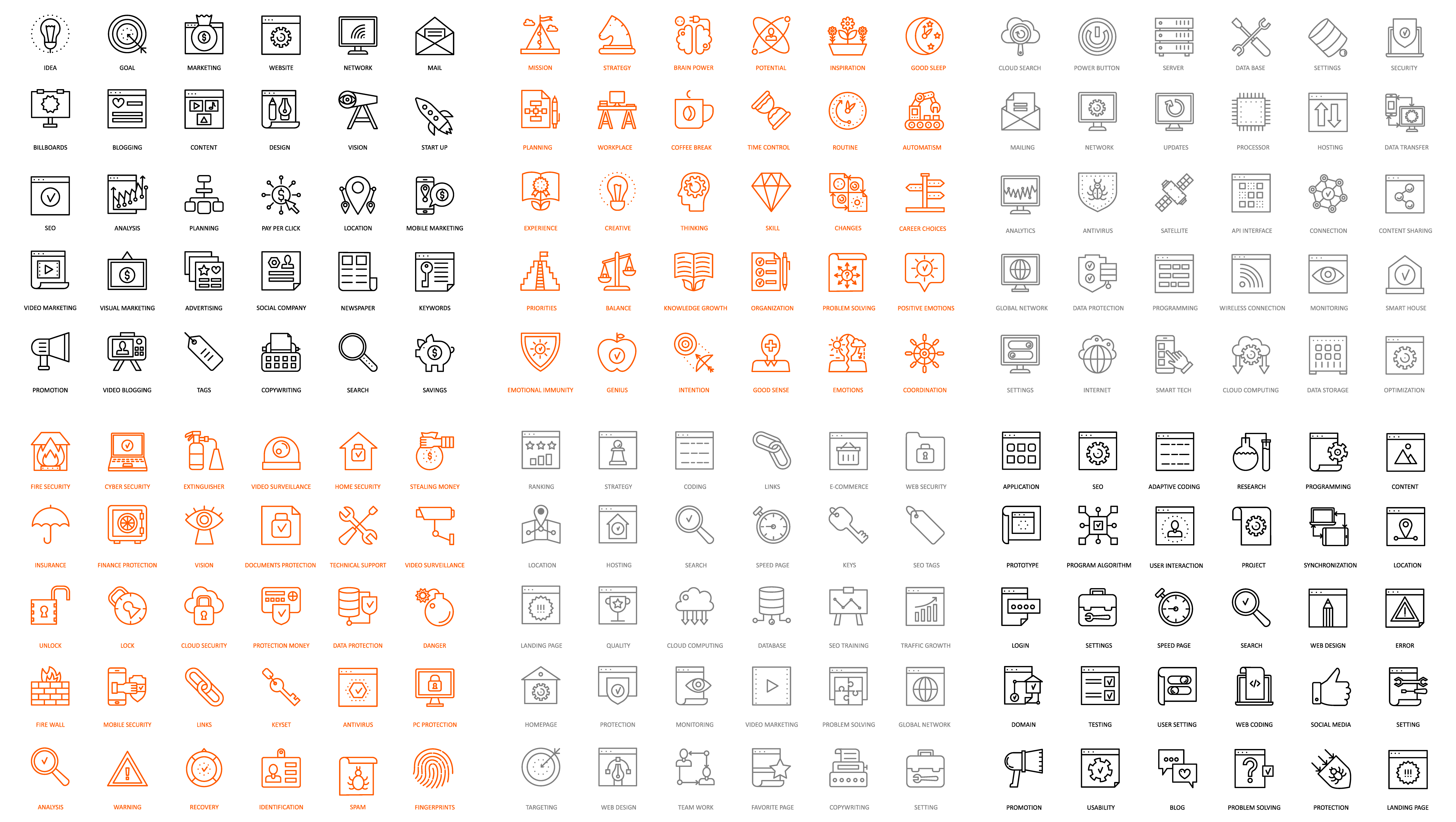
Iconography
Bespoke Icons created to emphasize the visual used in a work of art or the study or interpretation of these. Each icon can be colored in the Primary colors of our guidline, and used correctly.
Corporate Identity System
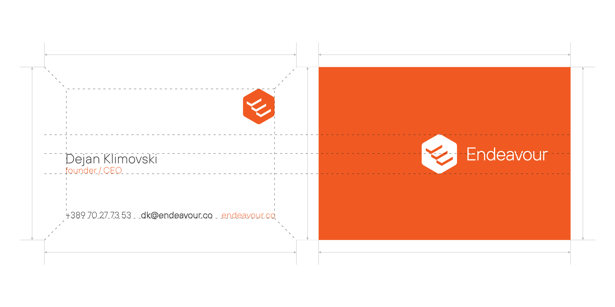
Business Card
Our business card is created in the standard shape and style by the European Print Commission. The long side of the card is 80mm and the short side is 55mm. To avoid the risk of unwanted cut the active and usable card is -10mm to the inside. On the back of the card we have our logo in white on the Endeavour Orange background. The logo on the back is fundamental for the front side. The lower line of the symbol is the aligment line for the job position, and the center line of the card is the top line for the owner of the card. In the bottom (With the -10mm working area we use the bottom of the line for our contact information, phone number, e-mail and our website. The top right angle is reserved for our symbol. The owners font size is 12pt, position 8pt, contact information 8pt. The size of the symbol on the top right corner is approximately 10mm wide. The logo on the back is 40mm wide. If there is a specific problem with someones name in case it's too long please contact us at goce.veleski (@) gmail.com
Memo A4
Our Corporate Memo is defaulted in A4 paper size, preprinted in bulk so we can have a continuous quality in the visual identity at our company. The layout of the memo is unusual, the logo goes from top left to top right, the additional informations like street address, phone, mail and web are on the right side of the page so when the memo goes into a binder the information can be accessed with ease. At the bottom in the white symbol we have our credo "Empowered Quality Excellence" and we'll use it as the signature at the end of a document or a letter. A better part of the memo is light grey (just a fraction from our corporate color Endavour Steel) and our symbol unbalancing the paper to push to the bottom so the first third of the page is free and uninterupted.


Letterhead (200x100mm)
The letterhead corresponds with our memo because they go hand to hand. The letterheads are also printed in advance to sustain the quality of the company.
ID Badge
The ID Badge is a key part of our corporate identity because it's the one thing that will be always by our colleagues and the need to be proud to have it on them all the time. Clean and in the spirit of the hexagon, the badge represents our culture, the company's face in front of other people. While wearing the badge other people should be asking themselfs "Where does this person works and is in this great mood? I wanna work there. I wanna be happy" The badge is a key pointer of the colleagues happiness with their job.
Drop Image
Thank you
Endeavour Brand Guideline V 1.0 / 27.09.2023
This is just the beginning of our journey. Our brand's potential knows no bounds, and as it continues to flourish, so will our aspirations, and the demands that come with it. This guideline is not just a document; it's a living entity, fueled by our unwavering commitment and tireless efforts. We must infuse it with motivation and dedication, for it to evolve and carve its path. Remember, we are the life force of this brand, and it reflects who we are. Together, we will propel it to greatness!
This Brand Guideline bears the imprint of Goce Veleski's meticulous craftsmanship. Any endeavor to modify, conform, or relinquish any aspect of this sacred document must earn the solemn endorsement of Goce Veleski himself. He stands as the sentinel of our brand's identity and the arbiter of its fate. Let it be known that every alteration made here carries the weight of utmost seriousness and is executed under his discerning supervision.