This is my answer to the Designer Hikes logo challenge. It features a bold logomark that can be used in a variety of mediums. I've included some information about how I arrived at this design.
Designer Hikes Brand Identity

Designer Hikes Brand Identity
Logo Design
Main Logo
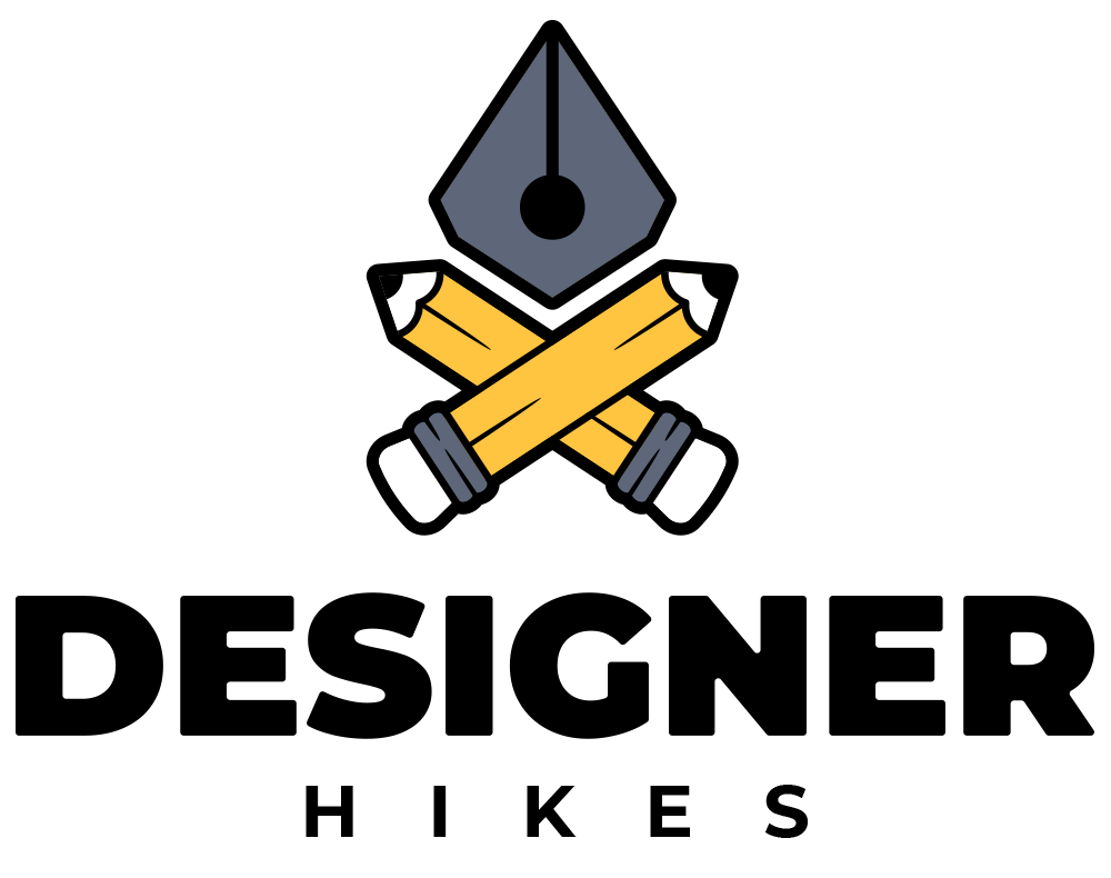
Horizontal Lockup

Alternative Logo
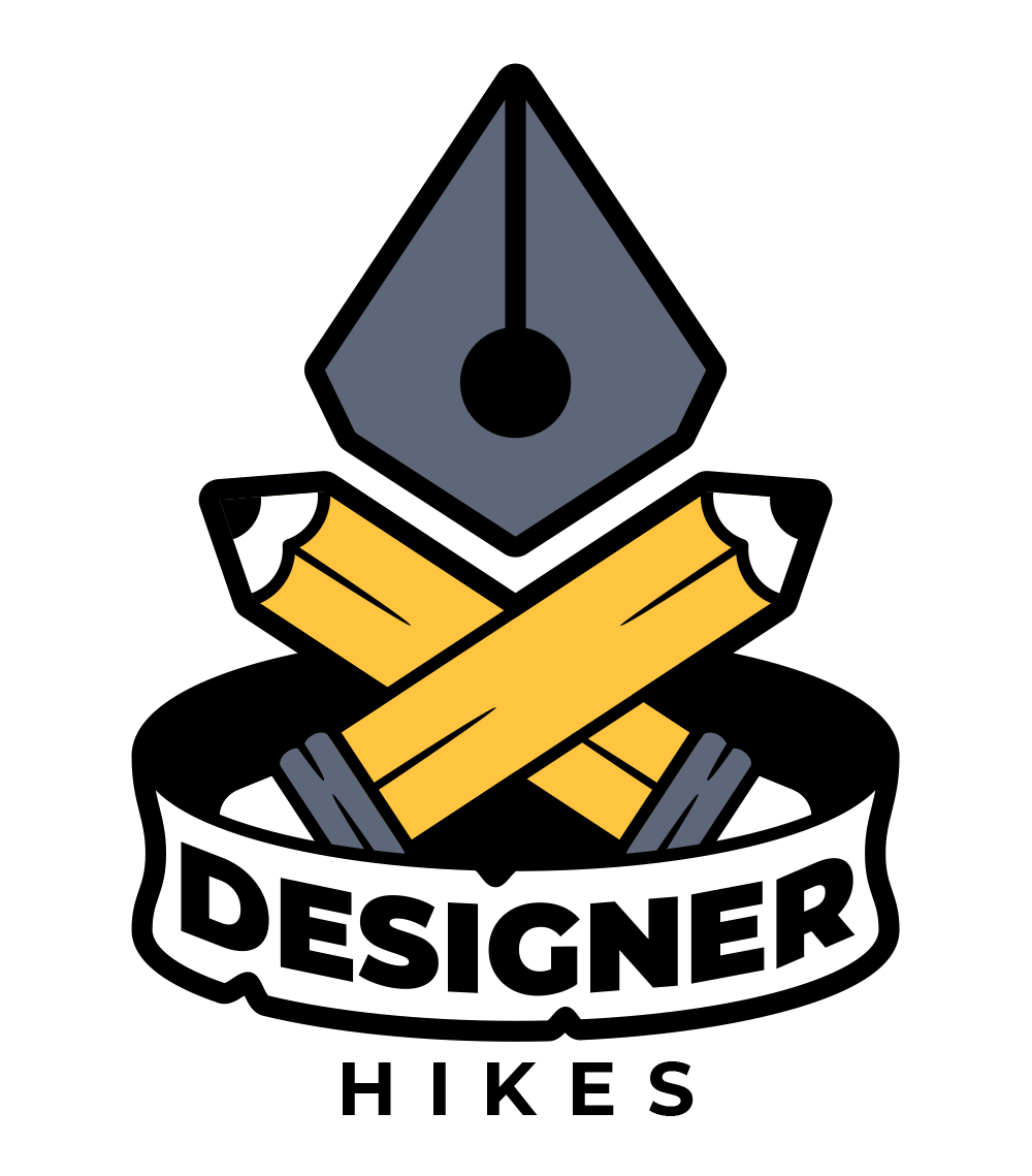
Alternative Logo 2
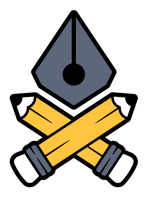

Simplified Logomark

The Idea
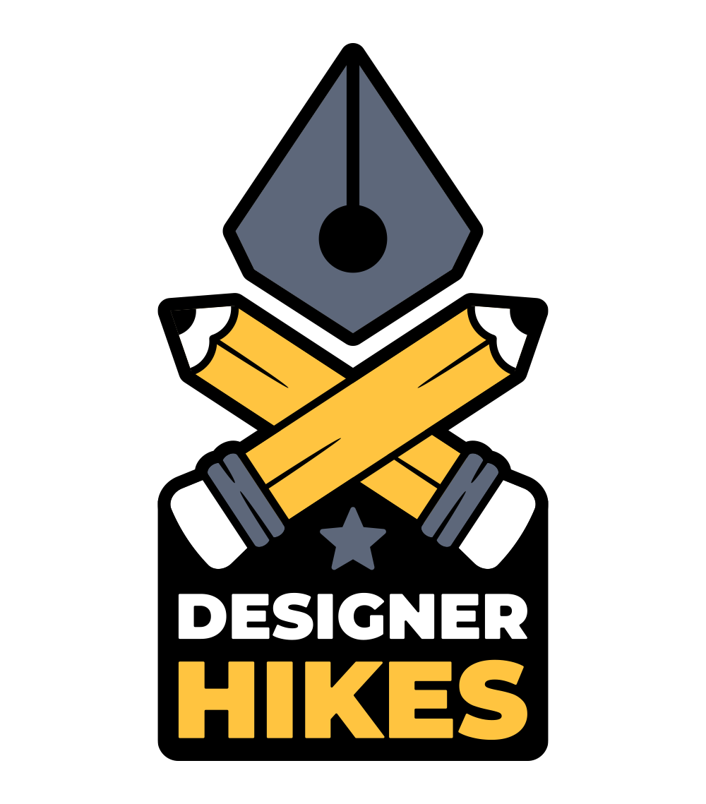
The idea behind this design involves a few different elements. I didn't want to make it obvious like other camping/hiking logos. So this meant diving a little deeper into who the target audience is. This led me down the creative tools route and creating a hiking themed logo with those elements in mind.
You'll see that I have used a pen tool icon as the campfire flame. This can also double up as a mountain peak. The two crossed pencils make up the wood that is usually seen being used for a campfire.

Additional Graphics
Compass
Sticker

Banner
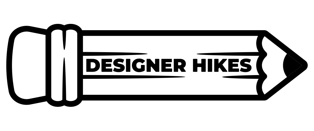
Pencil
Achievements

Colors
Primary Colors
Color 1
hex: #5D677A
rgb: 93 / 103 / 122
Color 2
hex: #FFC440
rgb: 255 / 196 / 64
Color 3
hex: #000000
rgb: 0 / 0 / 0
Color 4
hex: #FFFFFF
rgb: 255 / 255 / 255
Typography
Primary Typeface
Montserrat
Google Fonts by Julieta Ulanovsky, Sol Matas, Juan Pablo del Peral, Jacques Le Bailly
ABCDEFGHIJKLMNOPQRSTUVWXYZ
abcdefghijklmnopqrstuvwxyz
0123456789!@#$%^&*()?+
Secondary Typeface
Montserrat
Google Fonts by Julieta Ulanovsky, Sol Matas, Juan Pablo del Peral, Jacques Le Bailly
ABCDEFGHIJKLMNOPQRSTUVWXYZ
abcdefghijklmnopqrstuvwxyz
0123456789!@#$%^&*()?+
Patterns


Mockups
