Welcome to Magique, where enchantment, wonder, and magic come alive. These guidelines will help you capture the essence of our brand. A fragrance that transforms and inspires.
Thank you for being part of sharing the magic! ✨
Welcome to Magique, where enchantment, wonder, and magic come alive. These guidelines will help you capture the essence of our brand. A fragrance that transforms and inspires.
Thank you for being part of sharing the magic! ✨

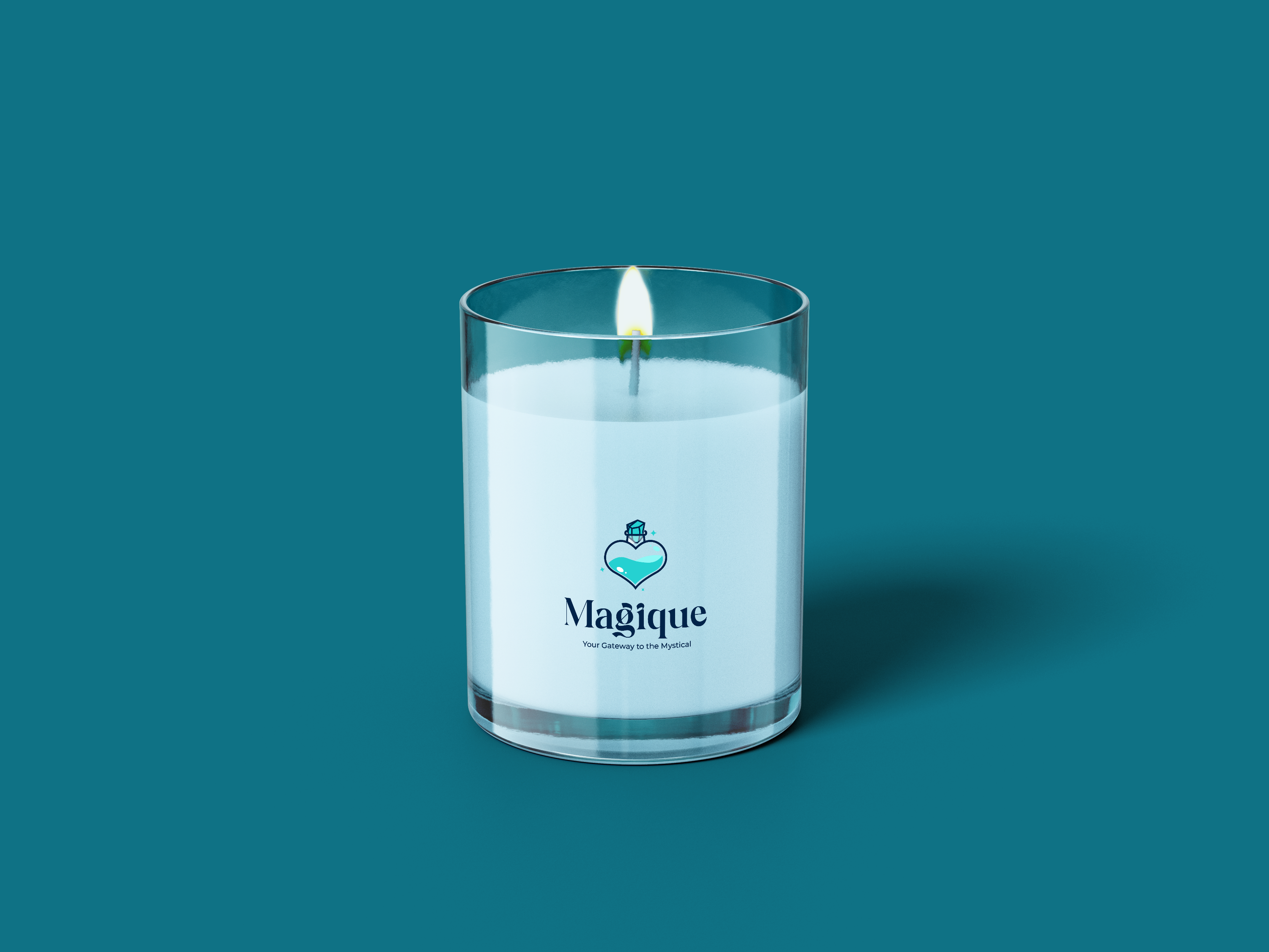
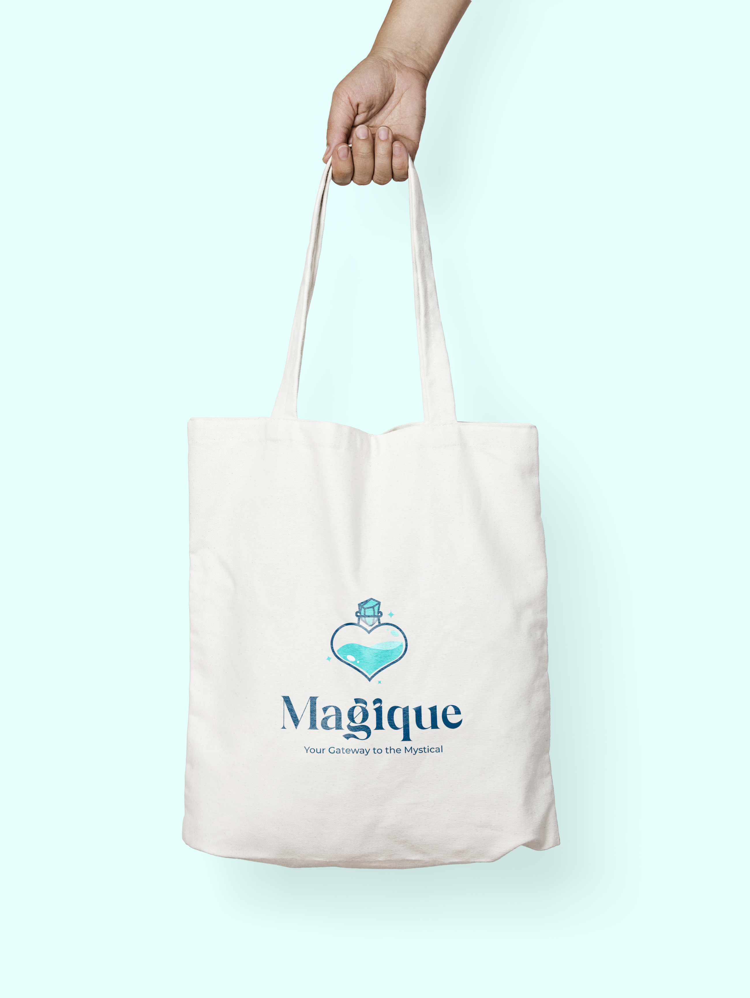
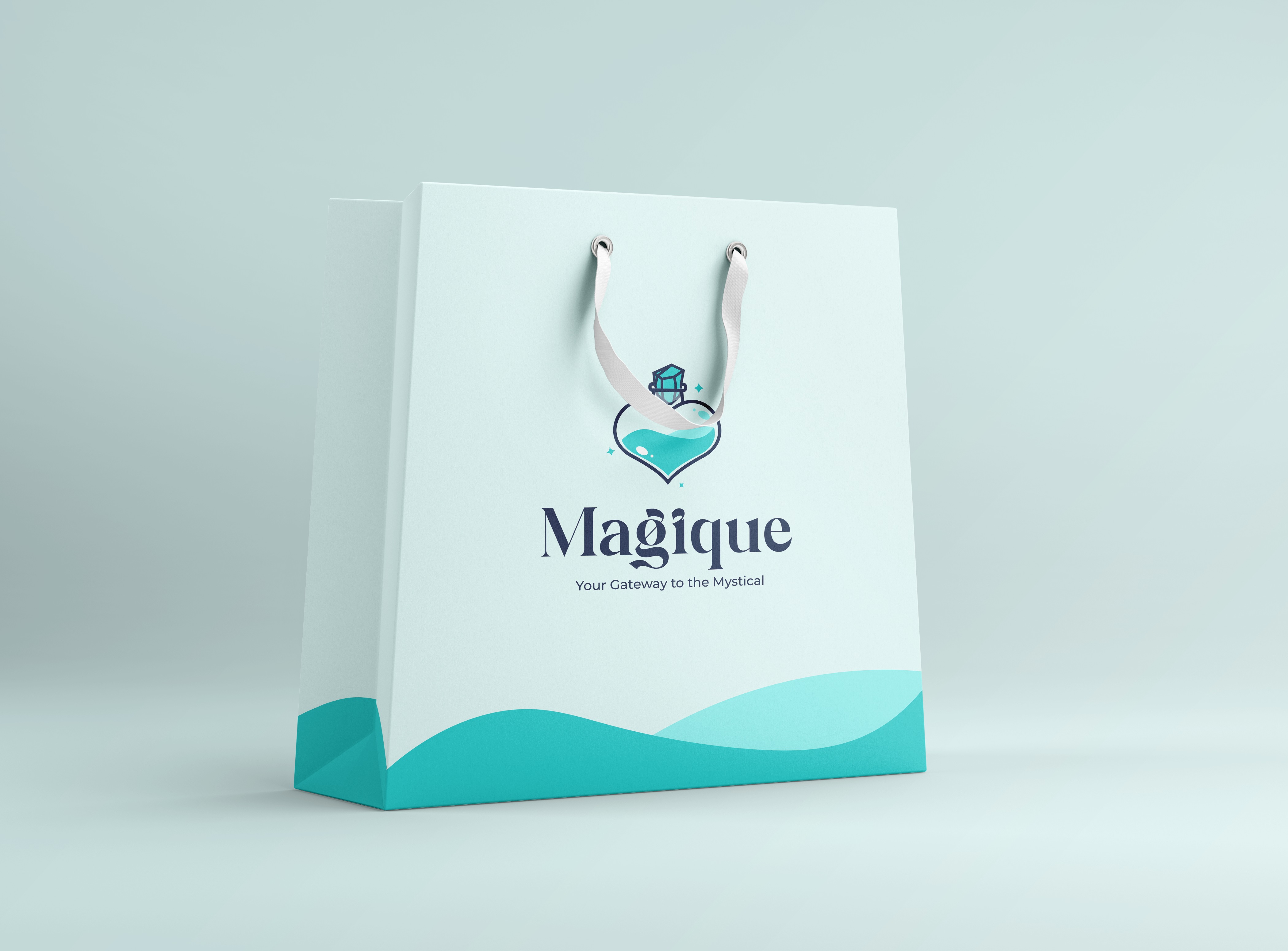
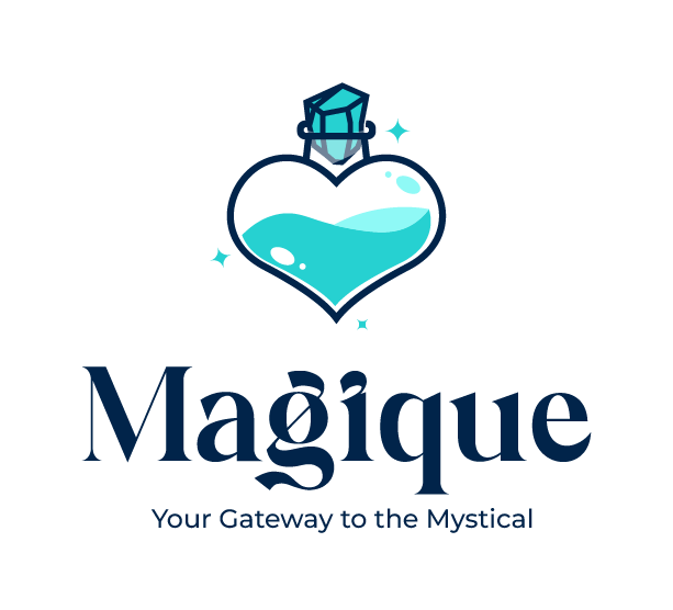
Our logo visually conveys the essence of enchantment, love, and wonder.
The logo embodies a sense of magic and mystique, which means that our brand is not just for scent, but for a transformative experience, akin to a potion or spell.
We have balanced the logo with a concept of Yin-Yang symbol, emphasizing harmony and allure.

Our logo embodies love, spell, balance and wonder, evoking a sense of magique and mystique. It represents the brand as more than just a scent.
It represent the brands as a transformative experience. As we intend to diversify from just perfume vendor to other aspect of human beauty.


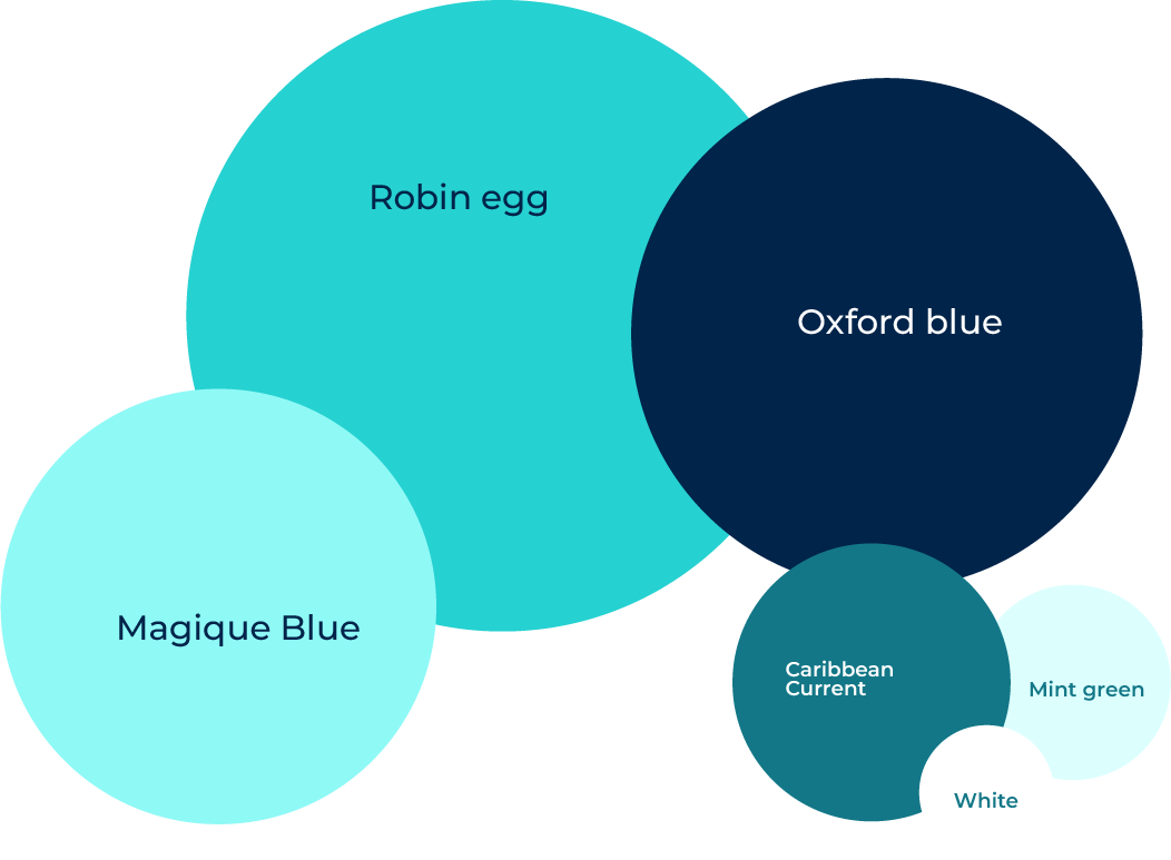
Ensure consistent and appropriate use of the brand's colors to reinforce identity and evoke the desired emotions across all platforms.


To complement our brand’s aesthetic and ensure optimal readability, we’ve selected Magical Signature as our primary typeface. Magical Signature is a clean, modern typeface with a sense of sophistication and elegance.
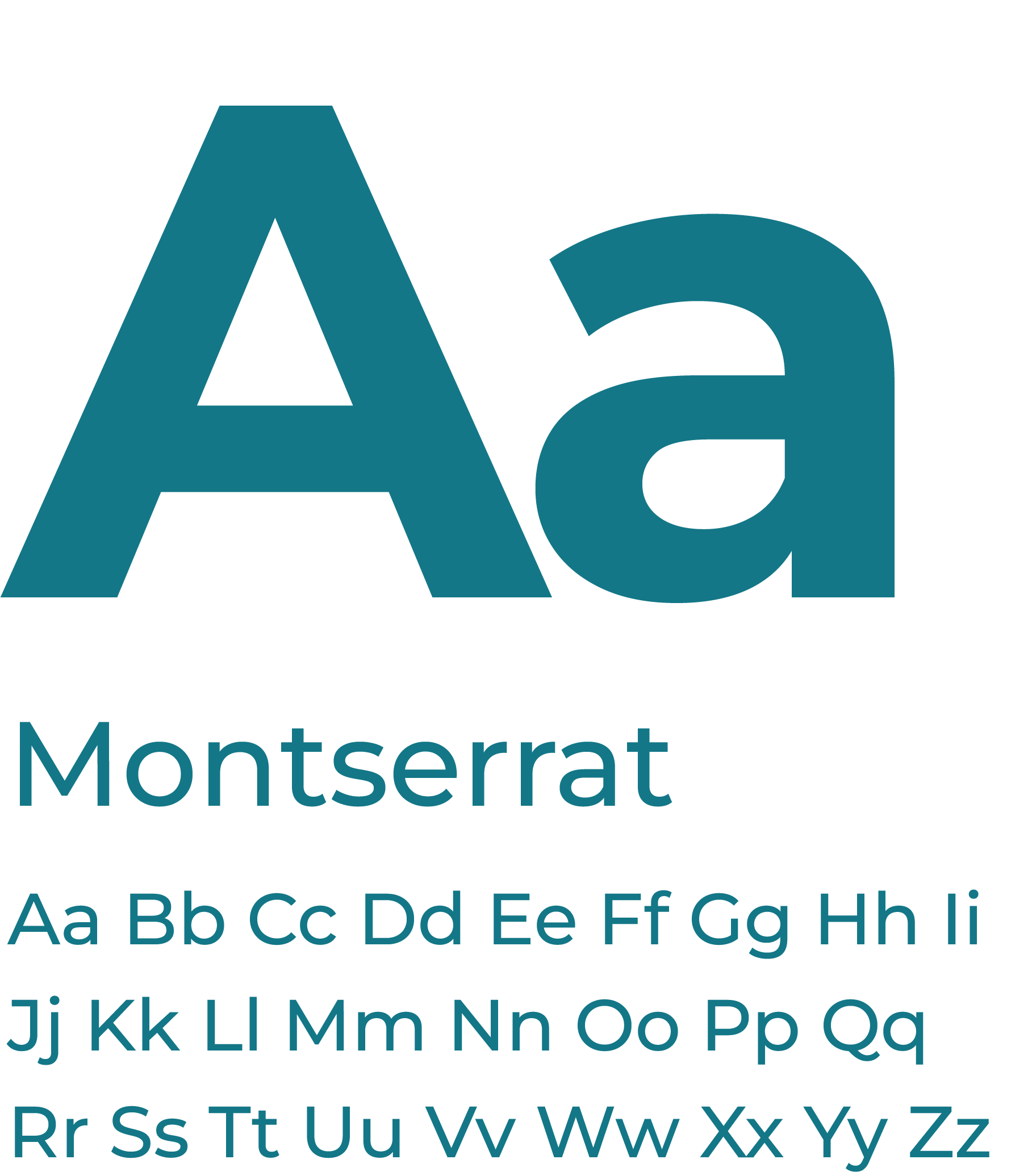
To complement our brand’s aesthetic and ensure optimal readability, we’ve selected Montserrat as our secondary typeface. Montserrat is a clean, modern typefamily that offers a wide range of weights, enabling us to create visually appealing and versatile designs.
Key Characteristics of Montserrat:
Clarity and Readability: Montserrat’s clean lines and well-spaced characters make it highly legible, even in smaller font sizes.
Versatility: The typeface’s extensive weight range allows us to adapt to various design contexts, from bold headlines to subtle body text.
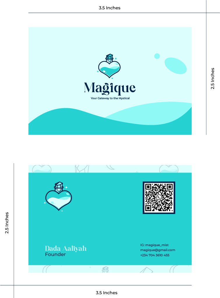
Magique’s business card features a visually striking and informative design.
The front side showcases the fluid like subsatance in our logo and the subltle reflection on our bottle.
On the back side, the founders contact details are presented in a clear and concise manner, using a simple and easily readable font, with a brief introduction of the brands pattern.
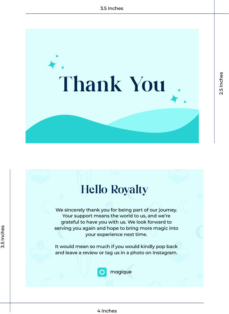
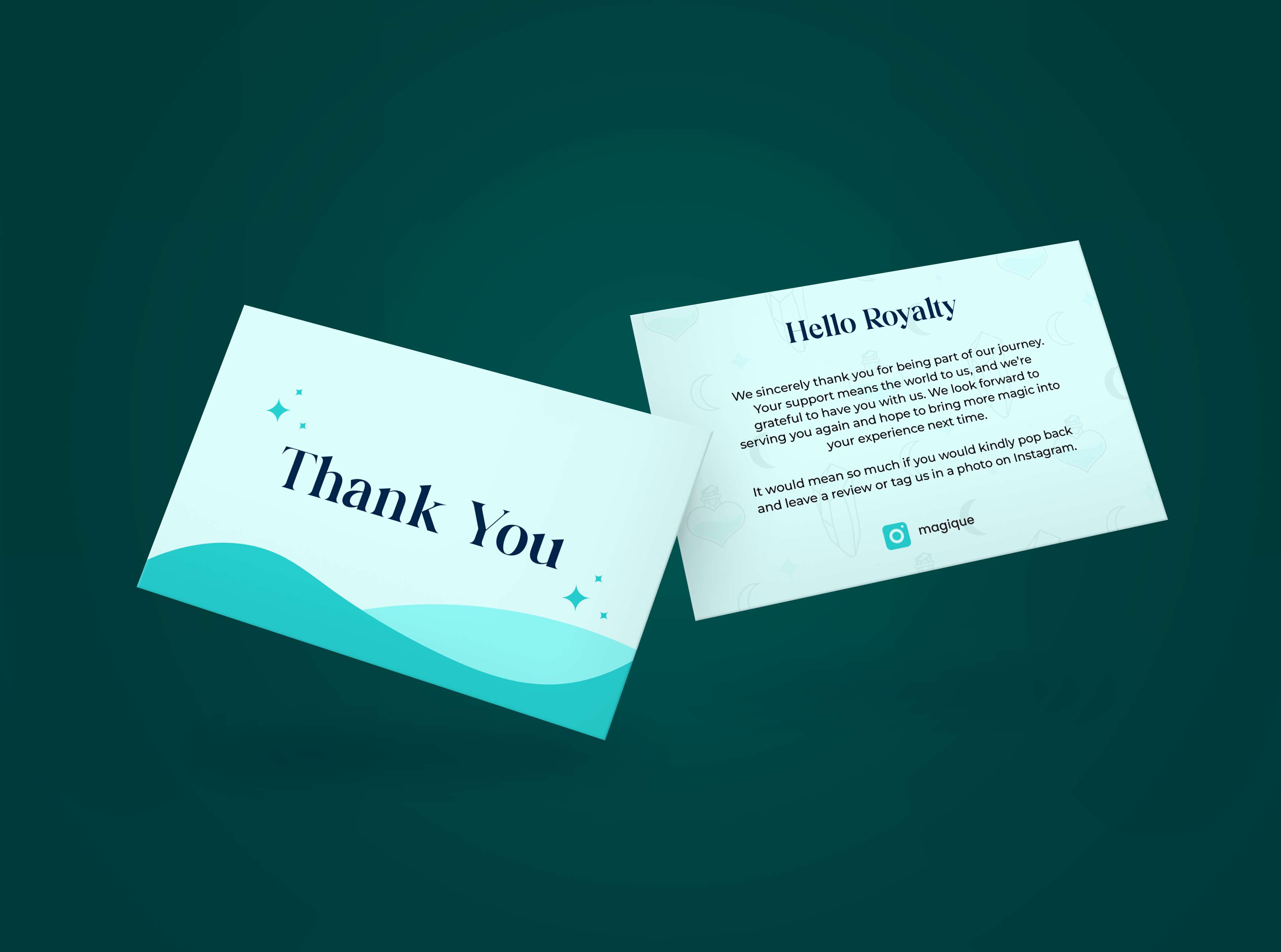
Magique’s thank you card features a visually striking and informative design.
Just like the business card, the front side showcases the fluid like subsatance in our logo with the subltle reflection on our bottle.
On the back side, is our appreciation message and the brands pattern.
