This document describes the primary aspects of Coffee & More's brand identity and visual design system. By closely observing these guidelines, we ensure consistent implementation of our brand assets on all platforms, maintaining a strong and unified brand presence.
The guidelines are accessible to everyone within Coffee & More, regardless of their design familiarity. They provide clear instructions and examples, helping all team members understand and adhere to the standards that make our brand unique.
By adhering to these branding guidelines, every member of Coffee & More contributes to upholding our brand's image and reputation, supporting our long-term success in the competitive world of coffee and related products.
Coffee & More

"Design is the silent ambassador of your brand."
- Paul Rand
- Paul Rand
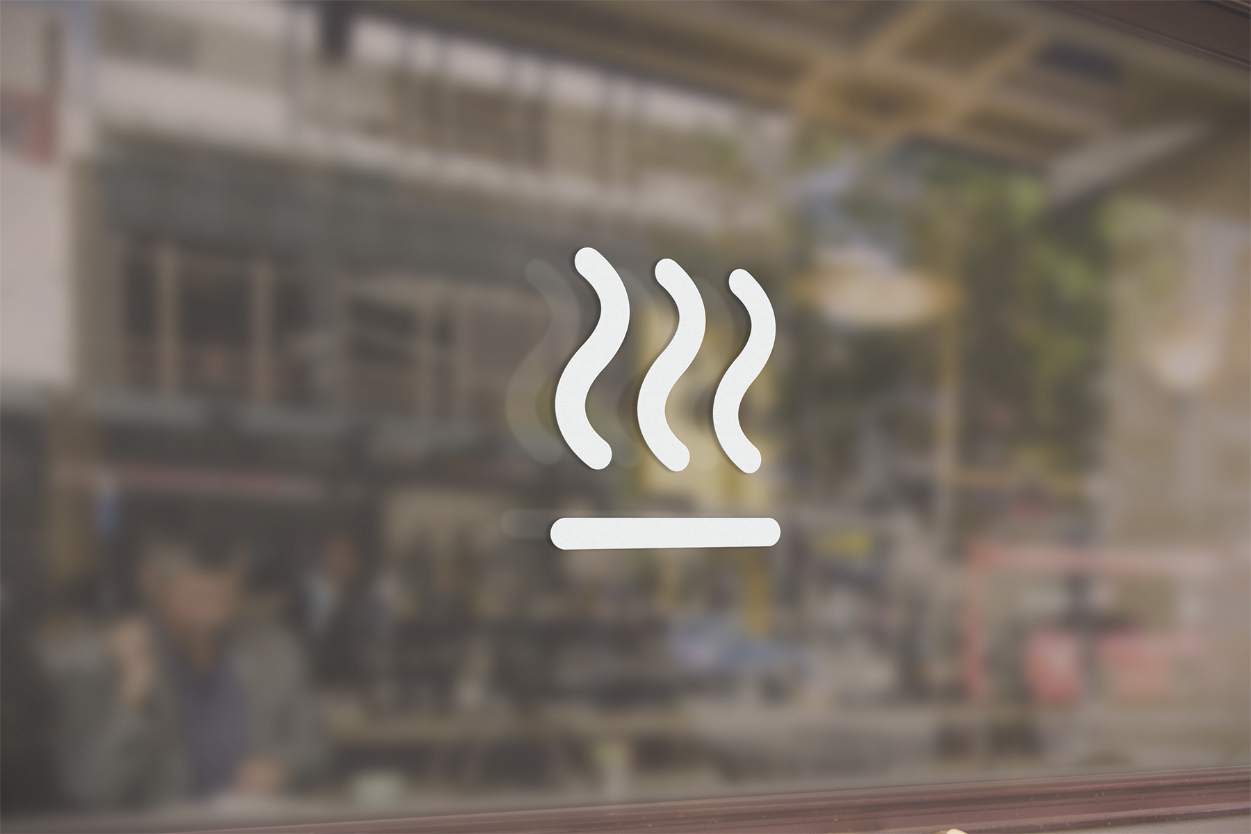
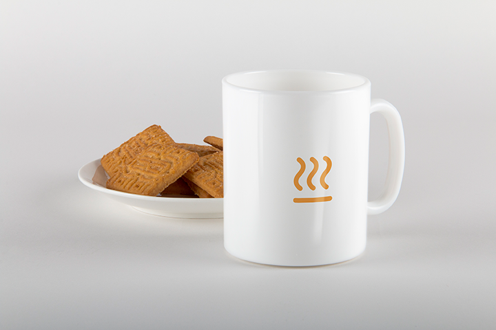
Logo
Master Logotype

Logomark alternative color

Logomark prefered color


Logotype (Dark)

Logotype (White)

Logo Compliance Instructions
Avoid stretching, skewing, or distorting the logo
Use only approved color combinations from the document
Refrain from adding drop shadow, outline, or bevel to the logo
Maintain safe distance, the size of an E glyph between this logo and other logos
Ensure the logo is clearly visible and legible on all backgrounds and platforms
Do not alter or remove any elements of the logo design

Color Palette
Primary Colors
C&M Orange
hex: #F68C21
rgb: 246 / 140 / 33
Ivory White
hex: #FFFFF0
rgb: 255 / 255 / 240
Charcoal gray
hex: #2B2B2B
rgb: 43 / 43 / 43
Key visuals & Branding deliverables


Typography
Primary Typeface

Supporting Typeface

A World of Flavor, A Place to Savor