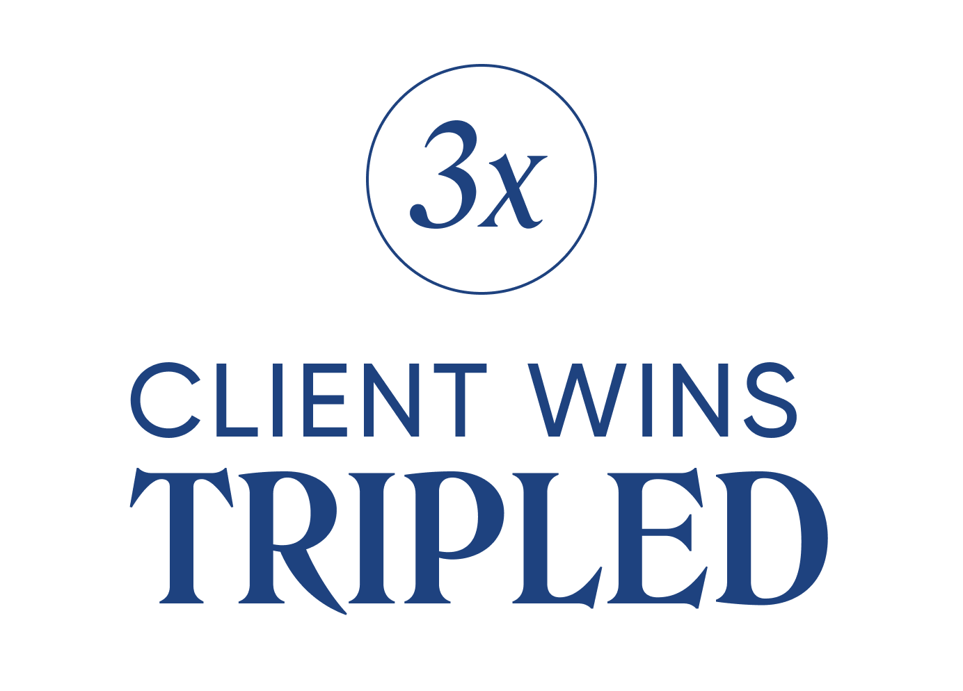

Buffalo Payroll makes payroll management an easy and efficient process by being a dedicated payroll partner. They understand the importance of seamless payroll management for businesses, and they're here to make it an efficient and stress-free process.
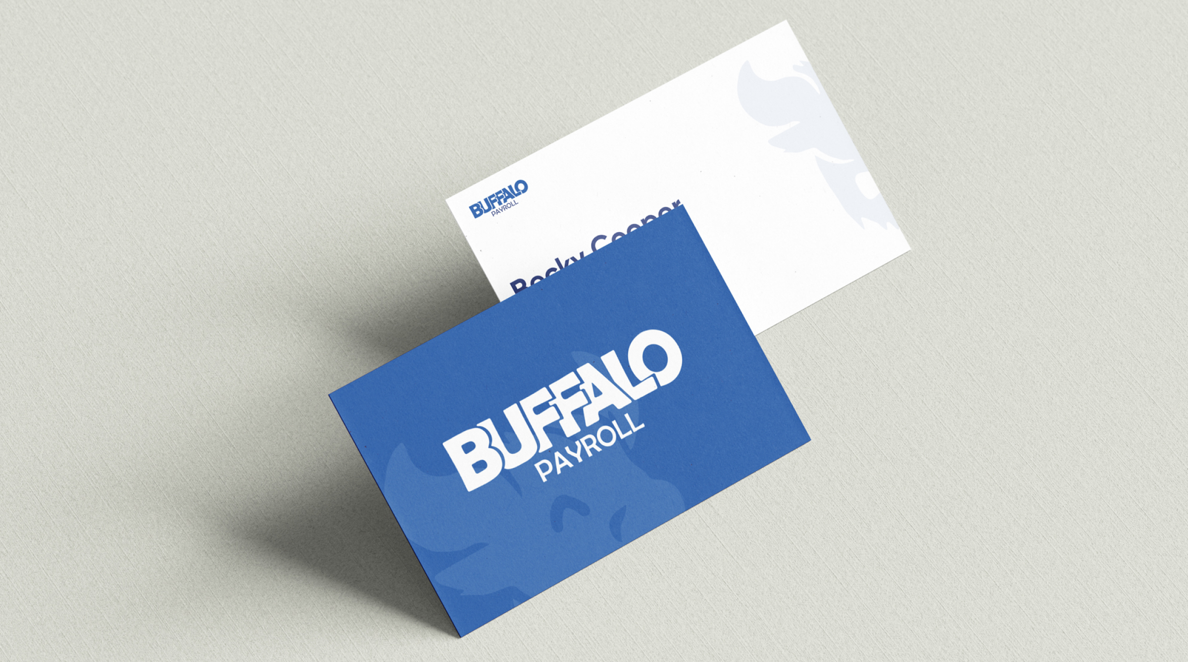
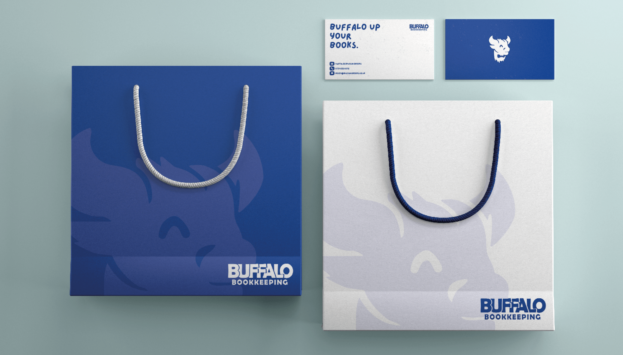
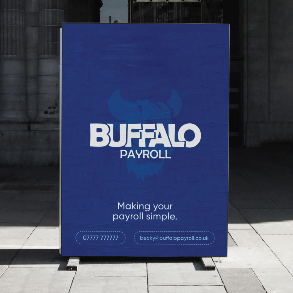
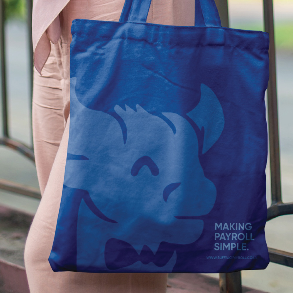
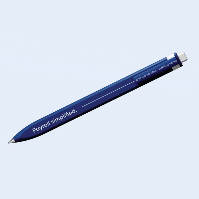
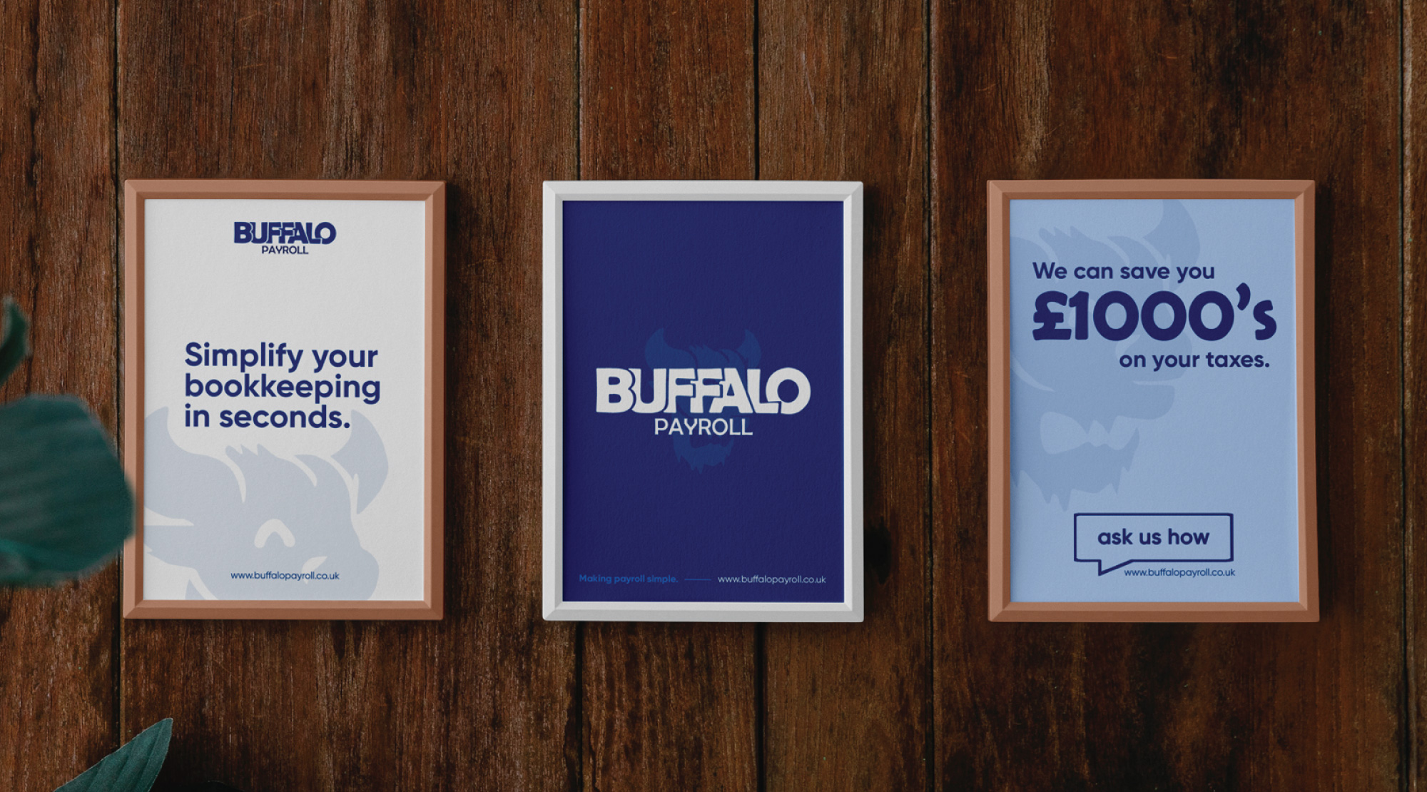
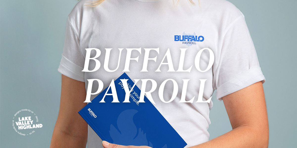
Aligning a brand with their message is crucial, which is something that Buffalo Payroll's original branding didn't do very well. Our goal was to develop a new identity that was directly parallel to their company's ideals and purpose, with their core messaging being "efficiency meets ease in payroll management". If they wanted to be a simple alternative, then their branding had to evoke the same idea.