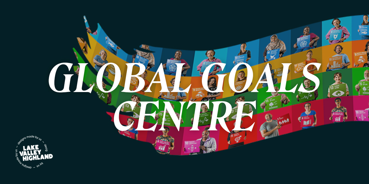
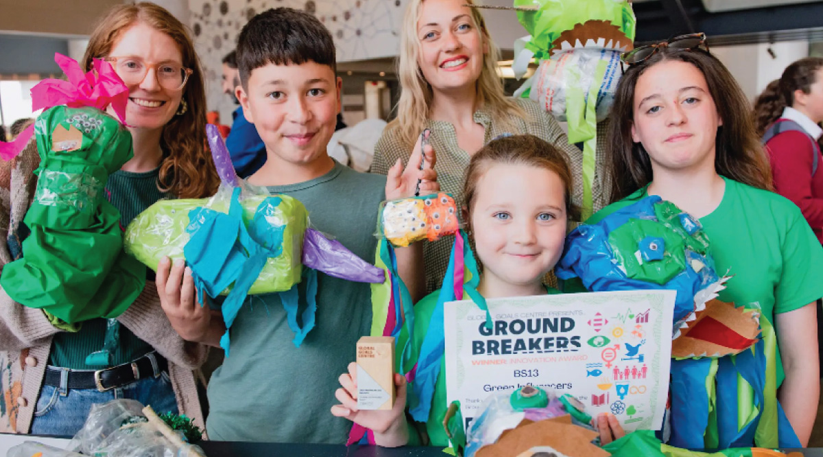
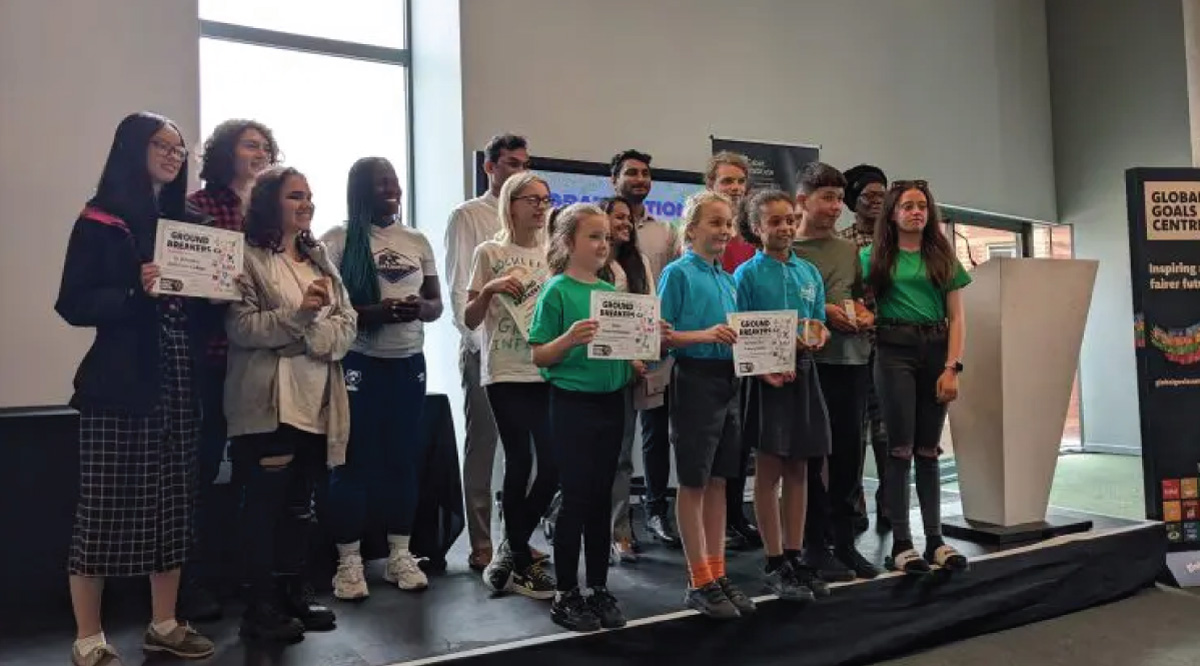
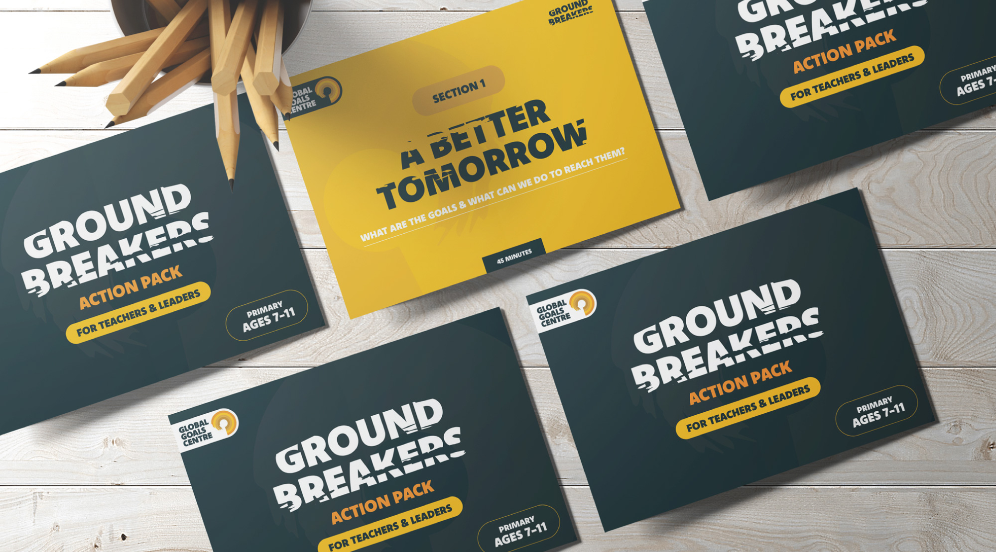
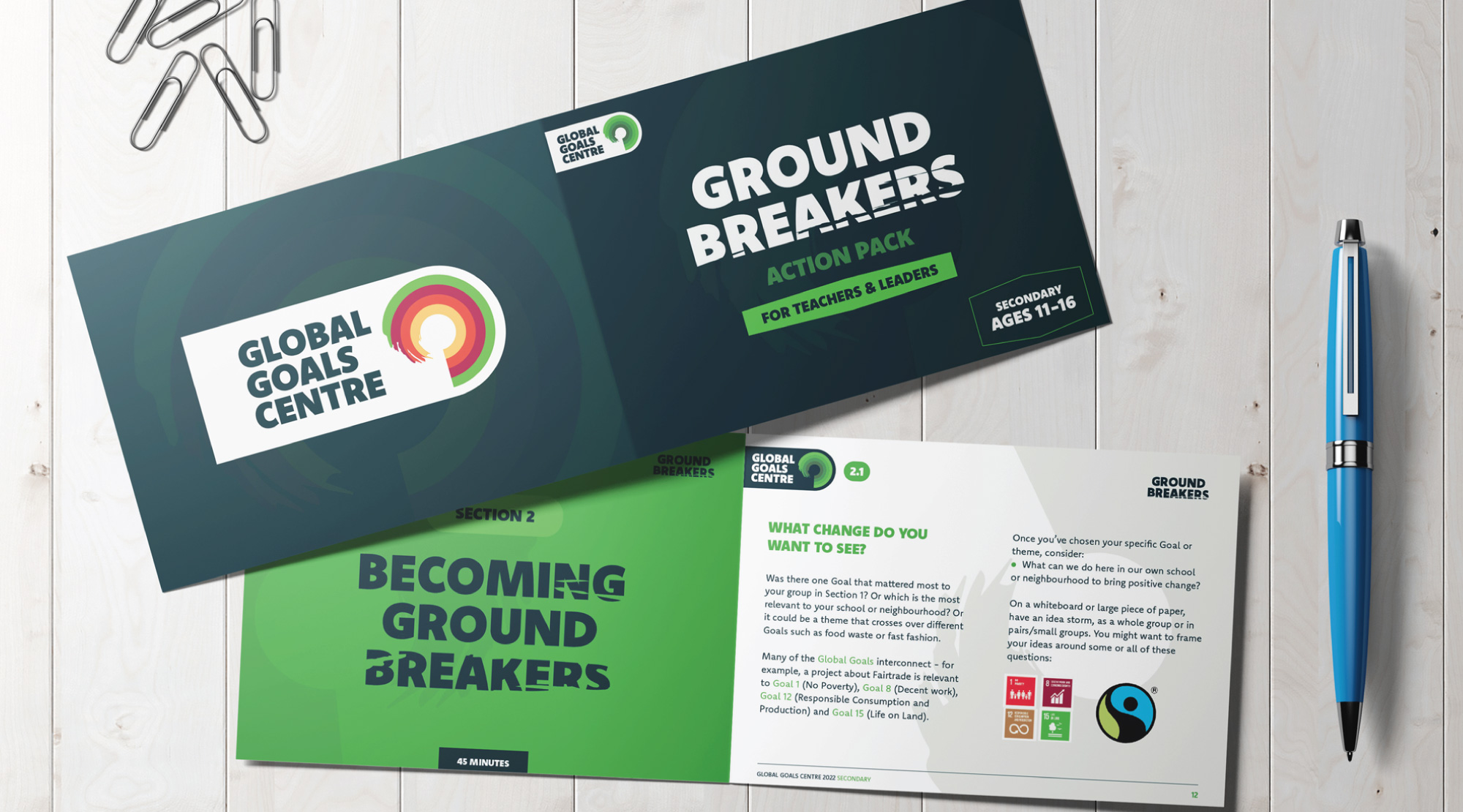
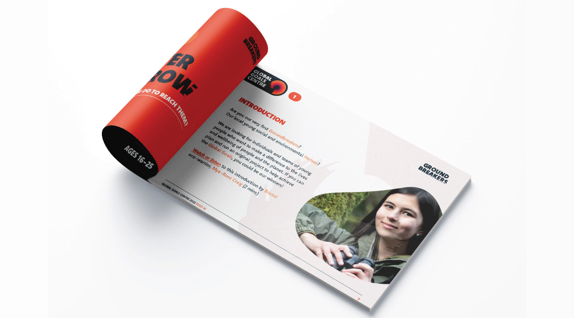
Global warming is breaking new records each year, and it’s showing no signs of slowing down. Our planet is warmer now than it has been in the last 800,000 years, and we’re using up more of the world’s resources than it can regenerate. Climate change could be irreversible by 2030, so apart from the governments finally getting up and doing something about it, we also need more people to take action for climate and social justice. This is why Global Goals Centre decided to run the ‘Groundbreakers’ competition across Bristol. It is a chance for young people from all ages to be creative and develop ways to cut their carbon footprint, general food and packaging waste, and even opt in for more renewable ways to use energy.
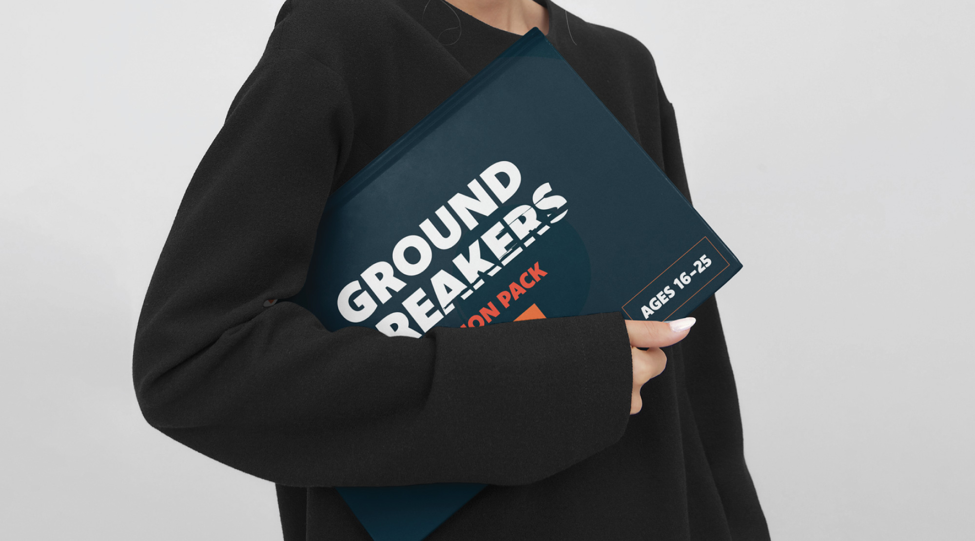
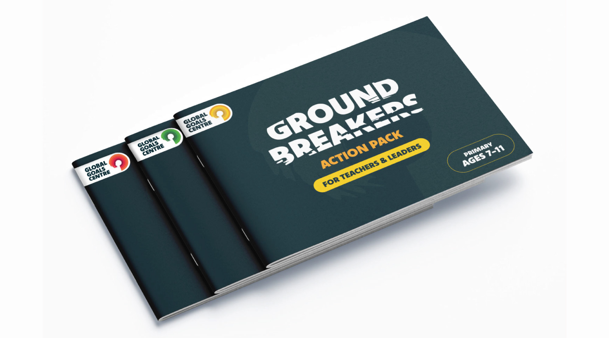
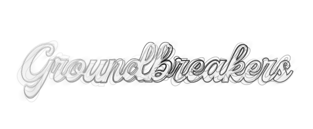
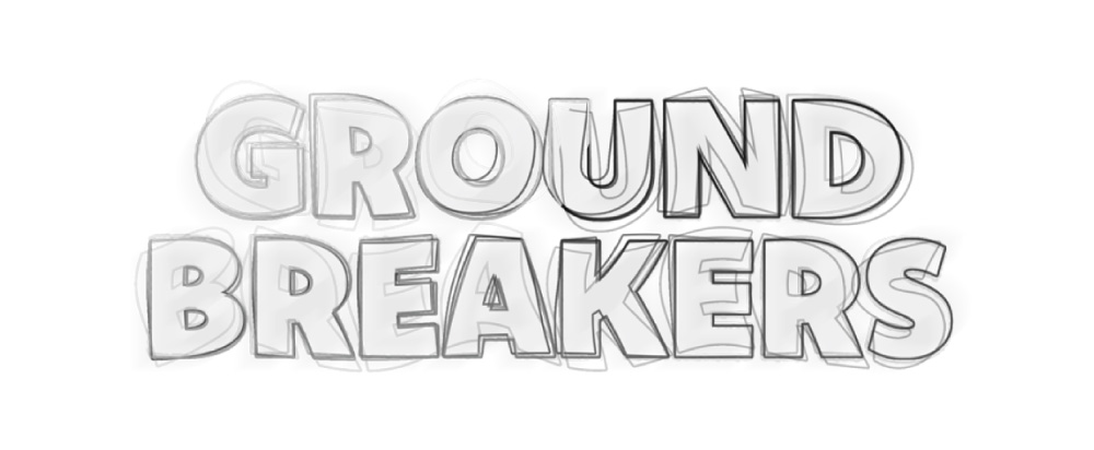
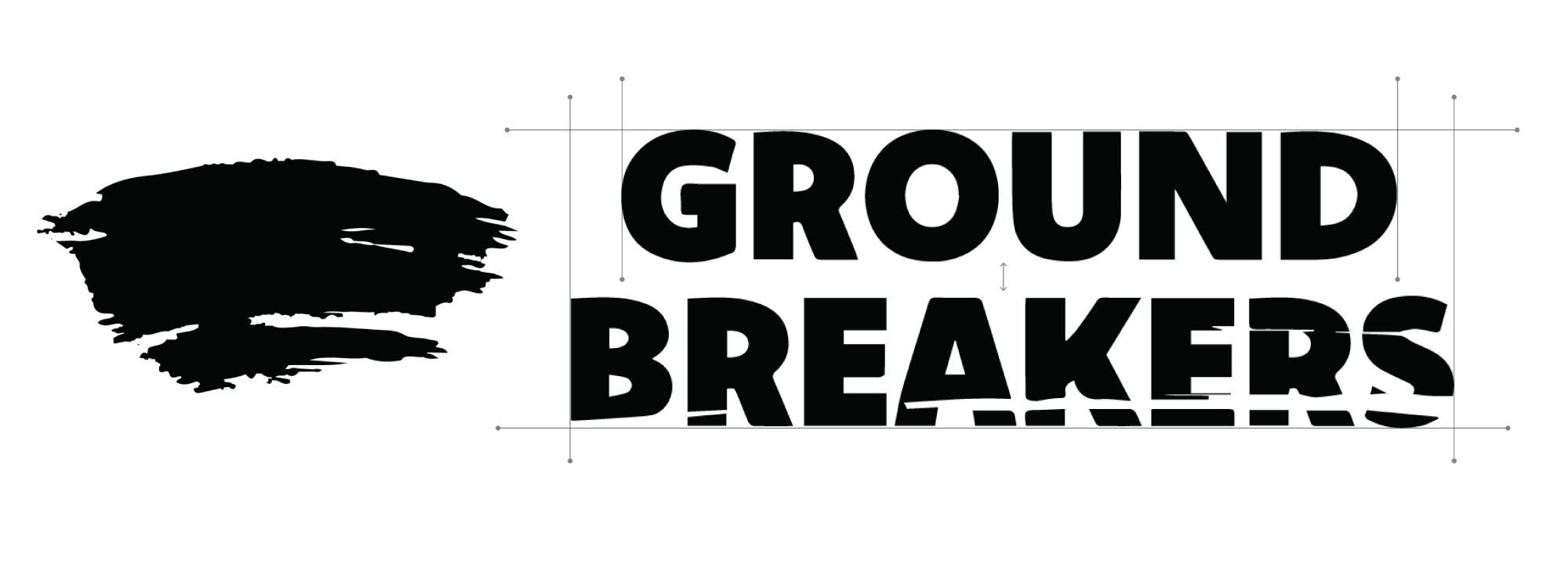
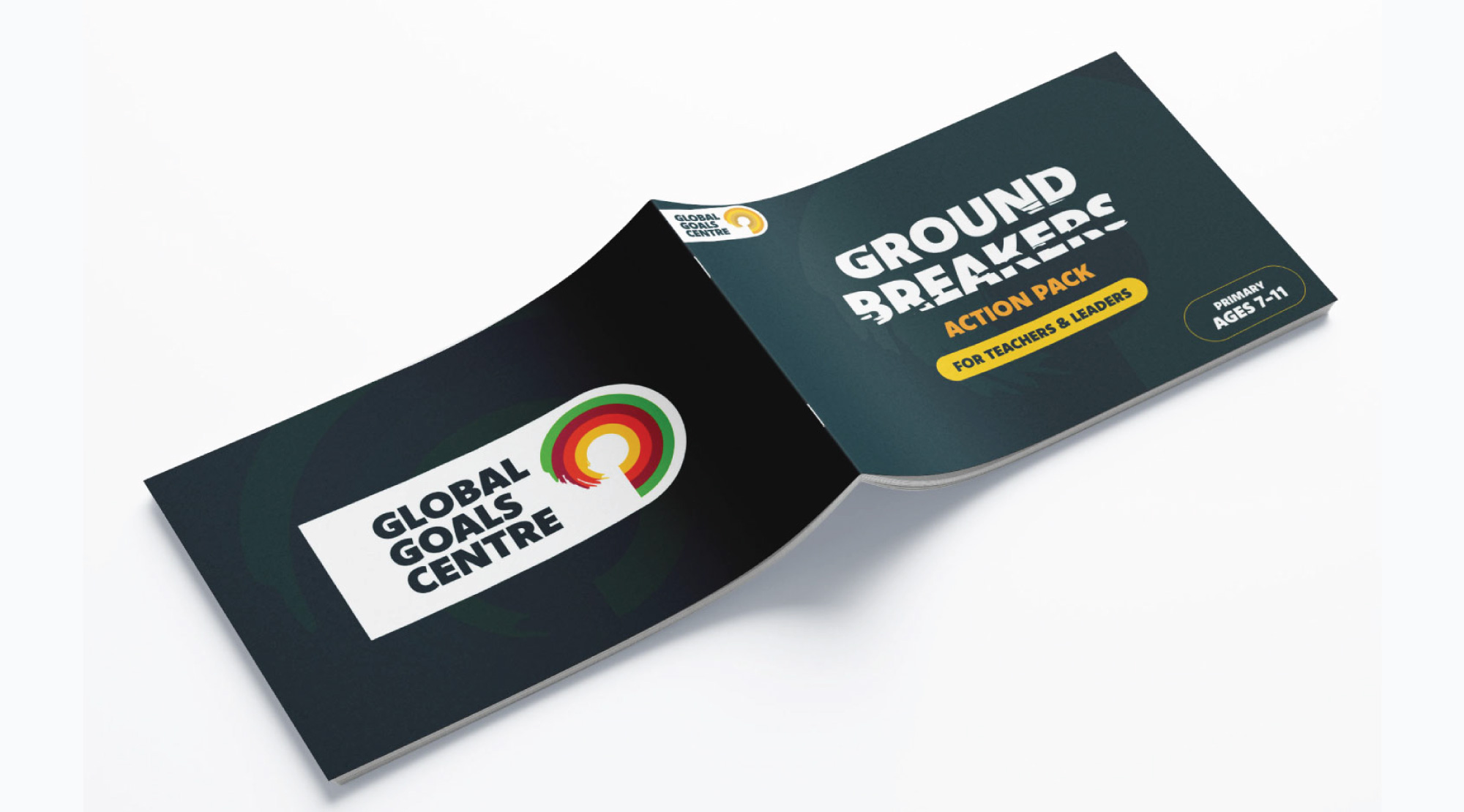
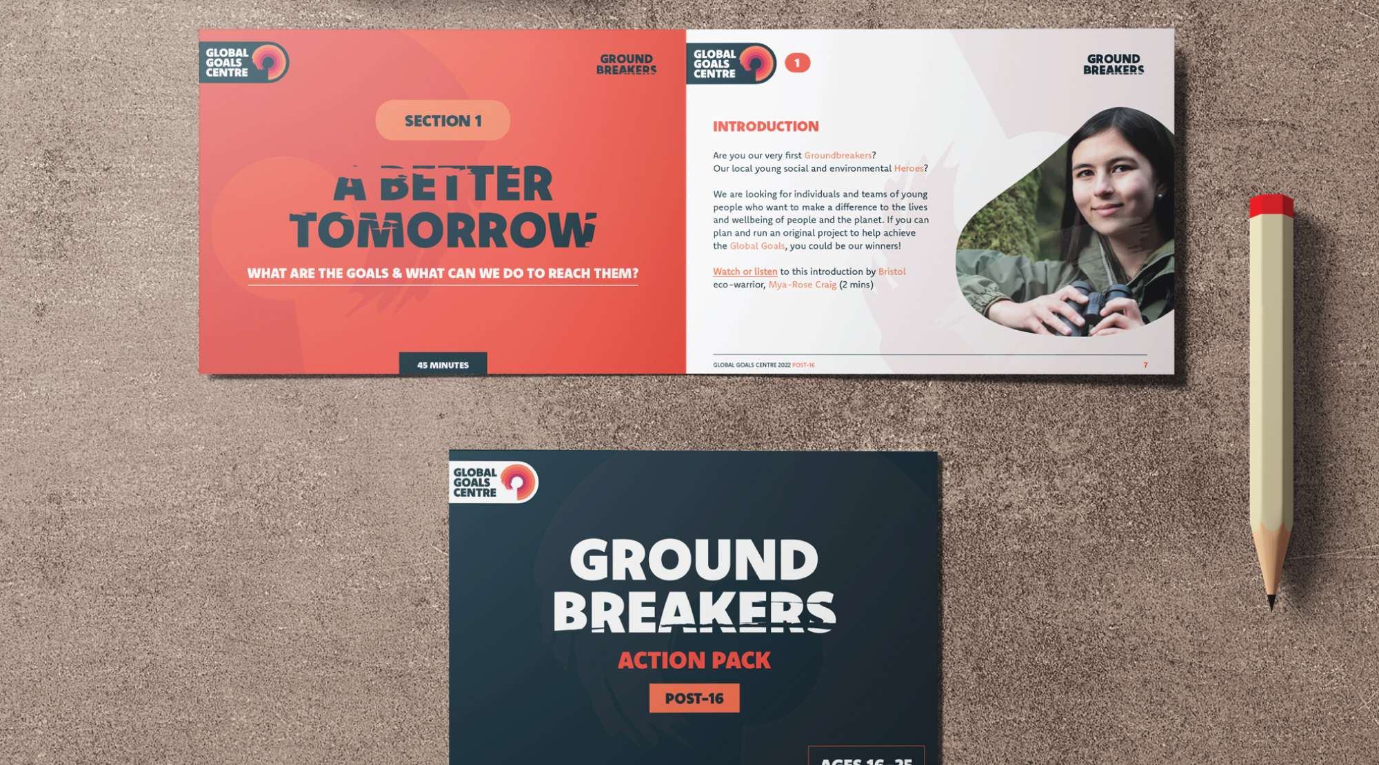
The name ‘Groundbreakers’ needed a simple visual representation that reflected its purpose; it was a competition that solely existed to give young people the tools to do good for the planet. Therefore, it needed to be bold and eligible, and it had to evoke the idea that it was standing up against the norm. Through many concepts, I decided to use the font ‘KOMET’ which was a bold, heavy, sans-serif type. With the layout and style set up, we wanted to add some grit to the design. It had to be a modest addition, and it could not take up too much space. We chose the below scribble which resembled a tear, representing the competition and its intention to break down boundaries.
