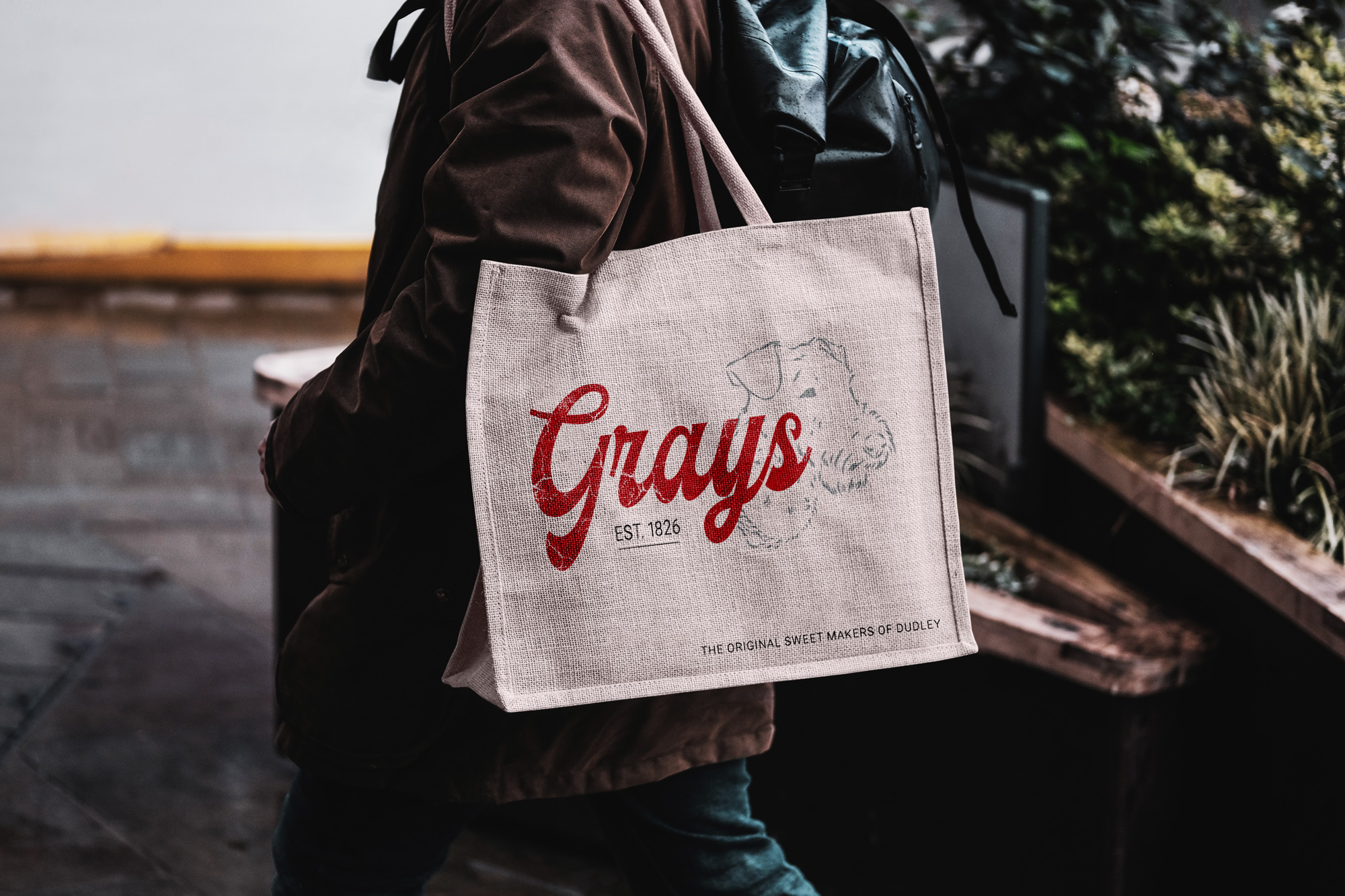
Teddy Gray's
Who is Teddy Gray's? 🍬

Teddy Gray's is a well-known family-run confectionery business based in Dudley, West Midlands. The company has been making traditional sweets and herbal tablets for over 100 years, since its founding in 1826. Teddy Gray's is famous for its handcrafted sweets, made using original recipes and traditional methods passed down through generations.


As a Yam Yam myself, I have fond memories of stopping by Teddy Gray's as a kid, usually after a long, dull shopping trip, to pick up a few bags of sweets. To say this shop holds a special place in my heart would be an understatement - it’s a cherished part of my childhood. That’s why I wanted to refresh the logo, giving it a modern touch while staying true to its heritage. My goal was to breathe new life into it, without losing the essence of its deep roots in the industrial history of the Black Country.

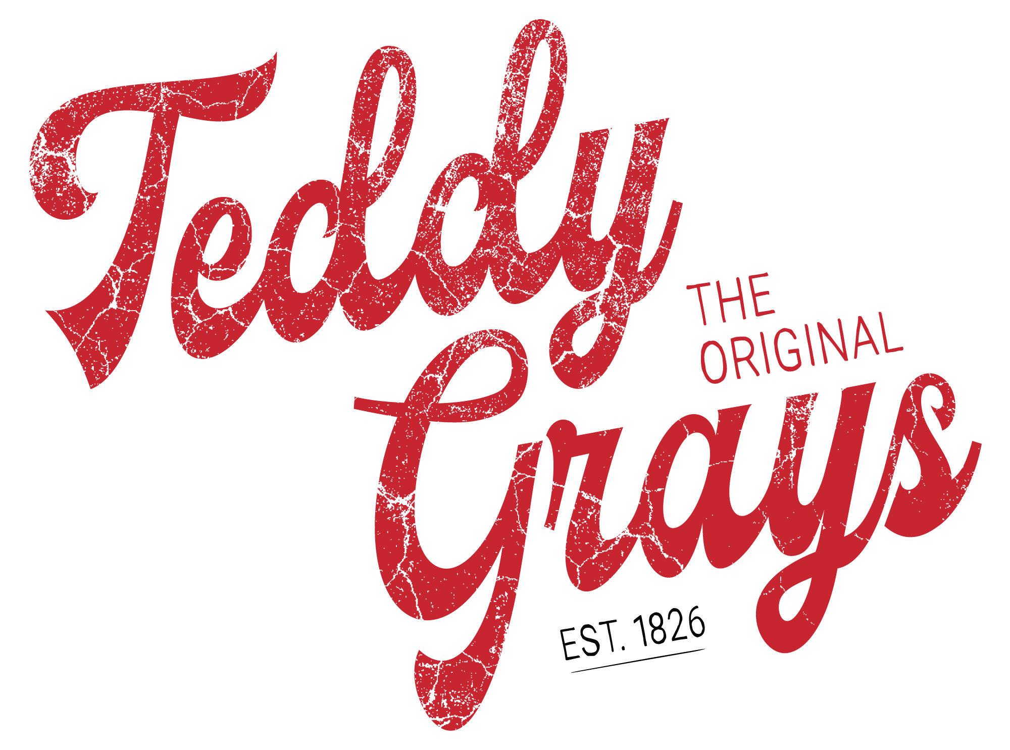
The challenge for this project was to modernise Teddy Gray’s visual identity while preserving the brand's legacy. The new design embraces the brand’s deep connection to its roots in the industrial Black Country, represented by its use of nostalgic, textured typography and a bold, vibrant red color. By reintroducing these historical elements in a fresh, contemporary way, the brand’s identity remains both timeless and relevant.


Through the revamped design, we’ve strengthened Teddy Gray’s narrative as “The Original Sweet Makers of Dudley". In applications like tote bags and packaging, the refreshed logo shines with its retro-modern vibe. The design is versatile enough to work across various mediums, from physical products to digital spaces. It evokes a sense of nostalgia for long-time customers and invites newer generations to engage with the brand, keeping the heart of Teddy Gray’s alive while looking toward the future.

The updated logo preserves the traditional script typography that embodies the rich history of Teddy Gray's. The distressed, hand-lettered red text symbolises both the timeworn authenticity and enduring popularity of the brand. The inclusion of a classic illustration of a dog pays homage to its heritage while injecting personality into the design, creating a sense of playfulness without sacrificing its traditional roots.


Whether on a tote bag or store signage, the design maintains its integrity and appeal, creating a cohesive brand experience that reflects both Teddy Gray's heritage and its contemporary identity.

Teddy Gray's Colour Scheme
Teddy Red
hex:  #C72530
rgb:  199 / 37 / 48
Black
hex:  #000000
rgb:  0 / 0 / 0
White
hex:  #FFFFFF
rgb:  255 / 255 / 255